PAGE IN PROGRESS: NOT FOR PUBLIC CONSUMPTION
Color Fields


Media: Probably C prints
Color Fields is a series of prints that takes traditional color-field compositions and “stretches” them, pulling partioned color areas across each other…
Black and White Versions


Experiments
Smashing an orange circle into its complement. Creates foreground/background depth:

Smashing smaller color fields together:

Same color field as above, but with lines that thicken overlaid:

Same color field as above, but contrasting study in short lines that thicken quickly. Basically, triangles. Reminds me of patchwork, some farms as seen from above, and some Paul Klee things. (It’s still too boring.)

Study in a smooth transition to analogous colors:

Another study in analogous color transitions:

Complements and diagonal symmetry study:

Color wheel study. So very ugly:
Same color wheel as above. Using fewer lines, but each line thickens quickly. Lots of alpha layering. It’s better:
Very pure radial gradient. Yellow-green-yellow-green-blue.

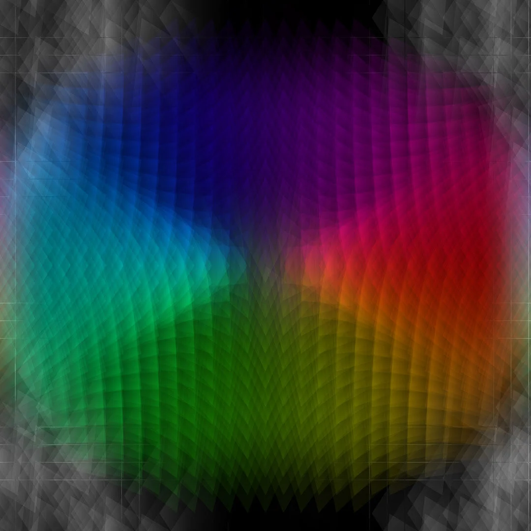
Study in radial gradients against a shifting red channel:

Study on a radially arranged set of color-field lines:


Study on a piece by Herbert Beyer:


Study on Paul Klee’s Double Tent:


Study in extreme minimalistm. Just a pure red color field. Only 12 “lines.” But lines thicken so fast they’re now circles.

Image from drawing test while painting in the color field. Ugly image. Fun drawing. Needs video.

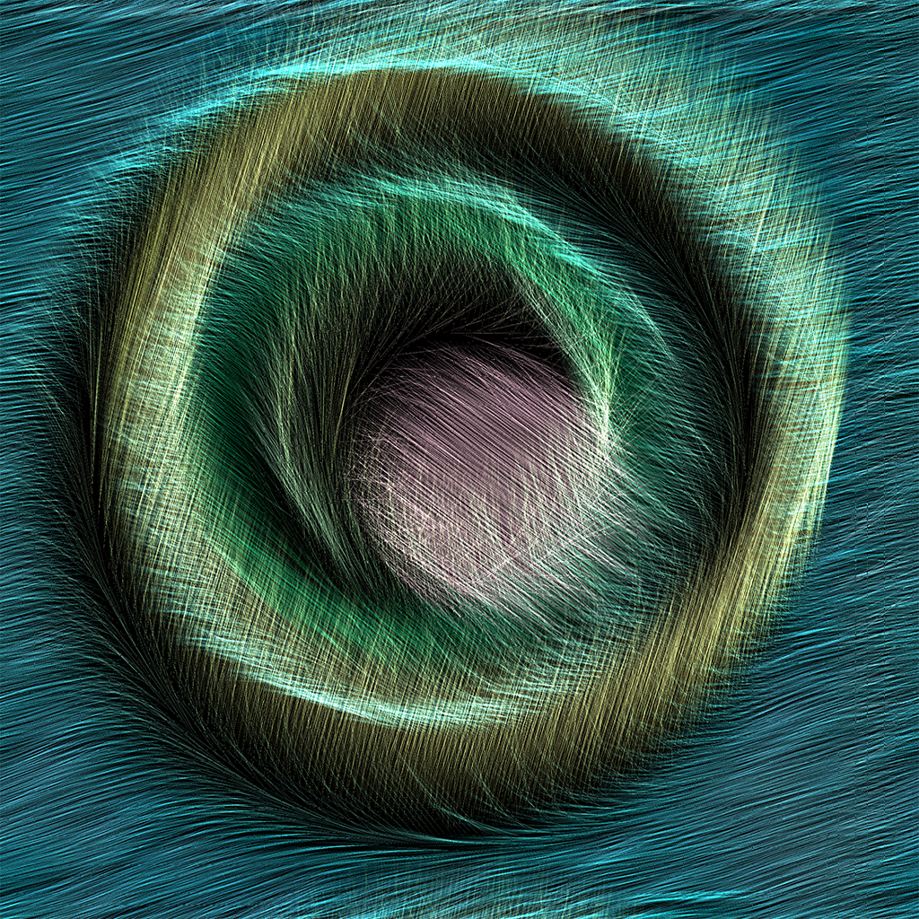
Test to see what a more organic color field would look like. Also a challenge to try to remove all of the many things I dislike about this input image (allover pattern, amorphous, too much saturated color, and others):

Test 1: Better. Metallic. Not great.

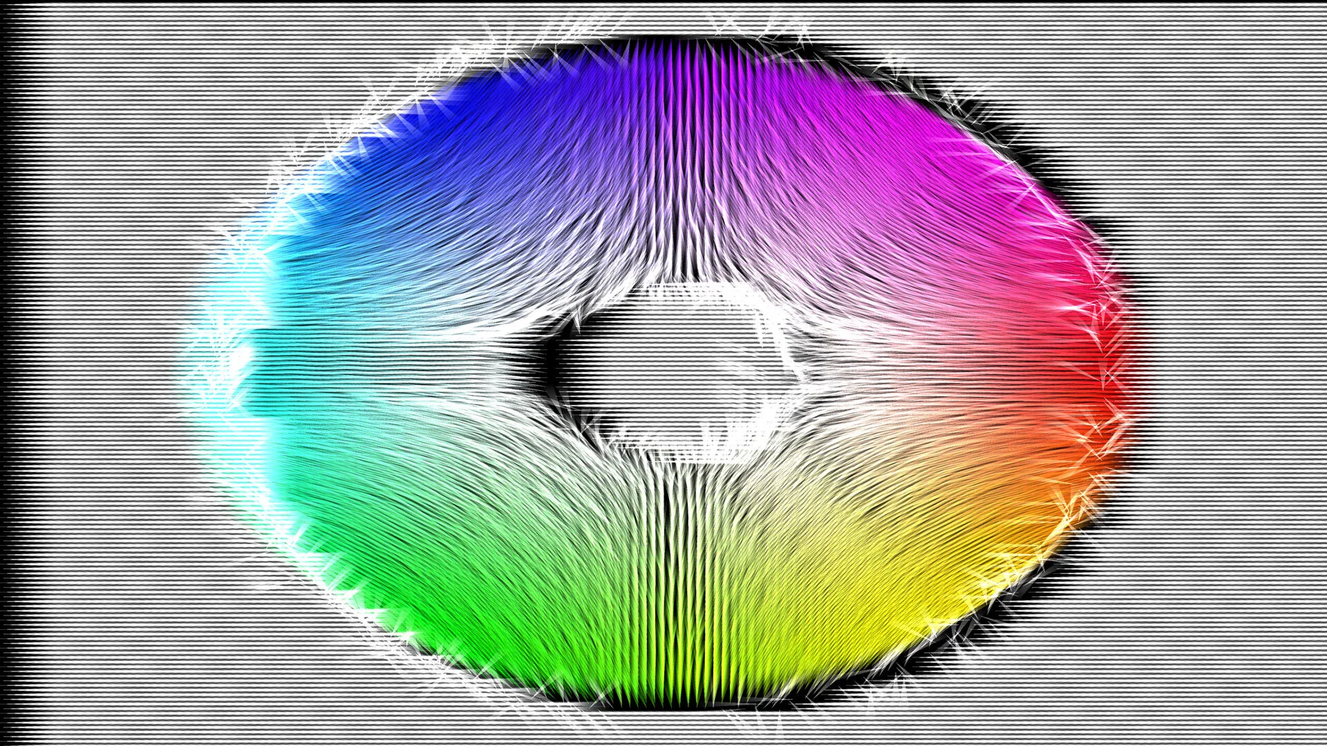
Test 2: thinner lines with more transparency works better. A focal point emerges as the composition becomes more hierarchical:
