Color Balance in Sequence and Space
While creating the sequence of colors that visitors can trigger an experience in the Pixel Poles, the notion of how to create a sequence and physical juxtaposition of color needed some attention. These experiments and resulting pieces are the record of balancing additive color across space as a preparatory study for the Pixel Poles.
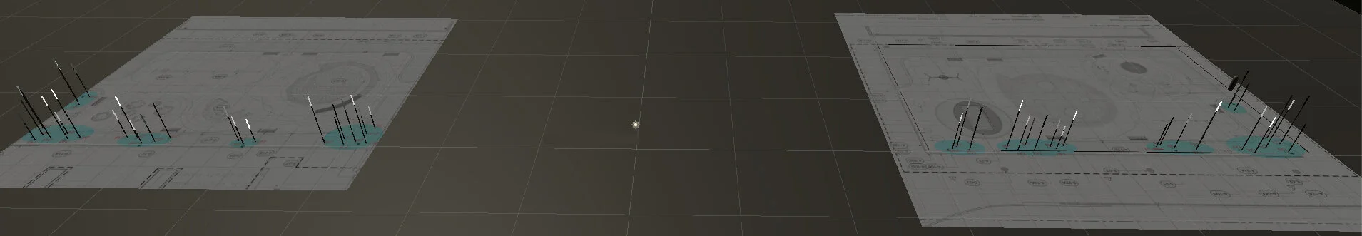
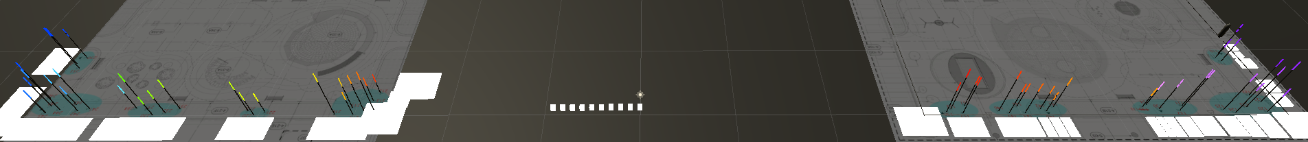
To recap the ultimate end goal of the study, here is a photo of one half of the Pixel Poles.

The above photo is one half the installation. On site, the poles are laid out across two sections:
As visitors come close to a pole, that pole will turn from white to a saturated color. As visitors walk across the plaza, the colors will form a sequence.
This interaction has some constraints. The color sequences need to be fully saturated, or nearly so. With no visitors present, the lights are white. Color only appears when people are present. If the colors in the color sequences.
There are 50 light poles. The problem can be distilled down into taking a point of white lights like this
and composing a color composition that looks balanced yet obtains enough color change per light to remain interesting as people walk through it.
A secondary goal is to create one or a few small pieces that more deeply examines the spatial juxtaposition and sequence of additive light. This is the current factor I have in mind:
Intuitive Try
Starting off simply intuitively picking a sequence of colors, I get this.
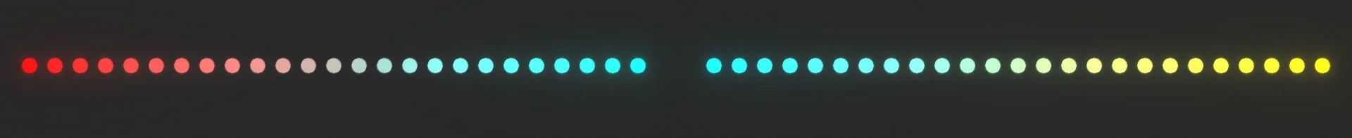
The first question to ask is “Does if feel balanced?” The temperature of color is a well-known theory. So is the forward/backward spatial positioning, which makes Hans Hoffman’s pieces work so well. But weight? Does color even have a weight? Kandinsky’s pieces seem to work as if they do, at least to me.
Searching a bit, apparently it’s been studied. Summarizing “Does Red Weigh More than Blue?” we get these take-homes:
Overall, blue is heavier than red, red is heavier than green, and green is heavier than yellow.
Brighter colors weigh less than darker ones.
Increasing saturation makes colors appear to weigh less.
Brighter backgrounds make dark colors look lighter (less heavy) and bright colors look heavier.
The last three don’t apply in this situation since the compositions need to be nearly fully saturated. Also, like almost all color studies, it was done with subtractive light.
Looking at the above composition, that study says red is heavier than green which is heavier than yellow. That means the left side of the above composition wants to tilt down, like someone heavier is on the left side of a see saw. Well, maybe. The left side is screaming for more attention, but I don’t know about physical weight. Balanced attention is really what I’m after anyways, not physical weight.
There’s another considerable problem with the above sequence. Red and cyan are exact complements. Going from one to the other goes through a pure 50% gray. If someone were to walk up to that particular light, it would simply dim. Probably no one would even notice it responded to them.
Approach from a Common Center
It seems it’s not going to be possible to move between complements, at least not directly across the color wheel. One way to get around that is to just move around the color wheel. Here are two patterns starting from a common center and going opposite directions.
I find these fairly satisfying. They might make a good composition using a tube light and either filters or colored light. But for the purpose of the Pixel Poles, these compositions are too minimal. People would have to walk 50 feet or so to see much of a color change.
They don’t feel all that balanced. In the top piece, the magenta screams more loudly than the cyan. In the bottom piece the yellow draws my attention more than the magenta.
More Hues
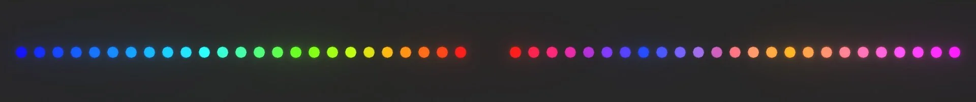
It’s obvious that at least for the Pixel Poles, the piece will need more hues. Or at least it will need faster changes in hues. An attempt:

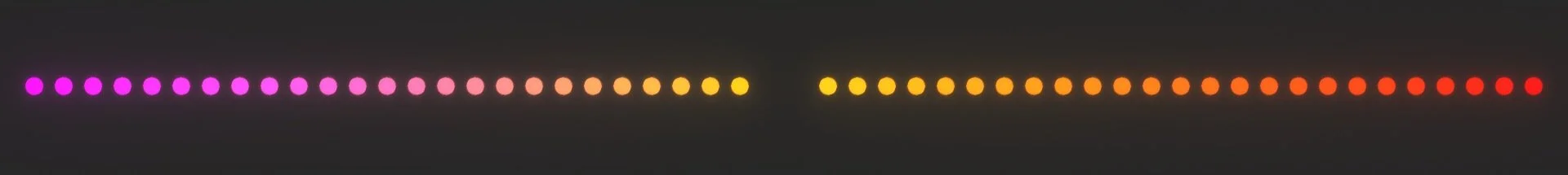
The reds are jumping out too much and they cyans on the left take up too much space. Changing reds to orange and breaking up the cyans with greens, we get this:

Previously Vetted
The above is looking pretty good. It would be garish for a static composition, but should work for the Pixel Poles. (The colors in the Pixel Poles will rarely be all lit up at the same time.) There is a sequence that I previously like. It’s time to look at it again having gotten a little smarter by thinking through the above.
There’s too much magenta on the right. It needs a hue inserted. I added orange near the center and moved the blue over.
The problem is that this smashes yellow and blue next to each other. You can see the pure middle 50% gray value. It will look terrible on site.
Keeping colors saturated as they change
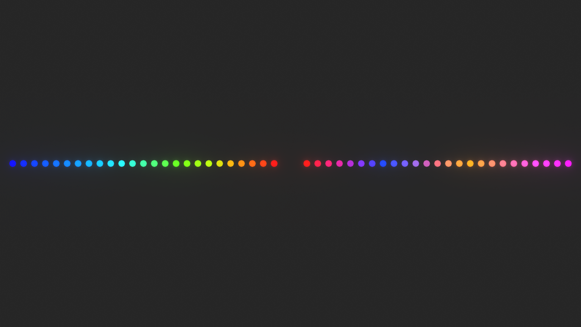
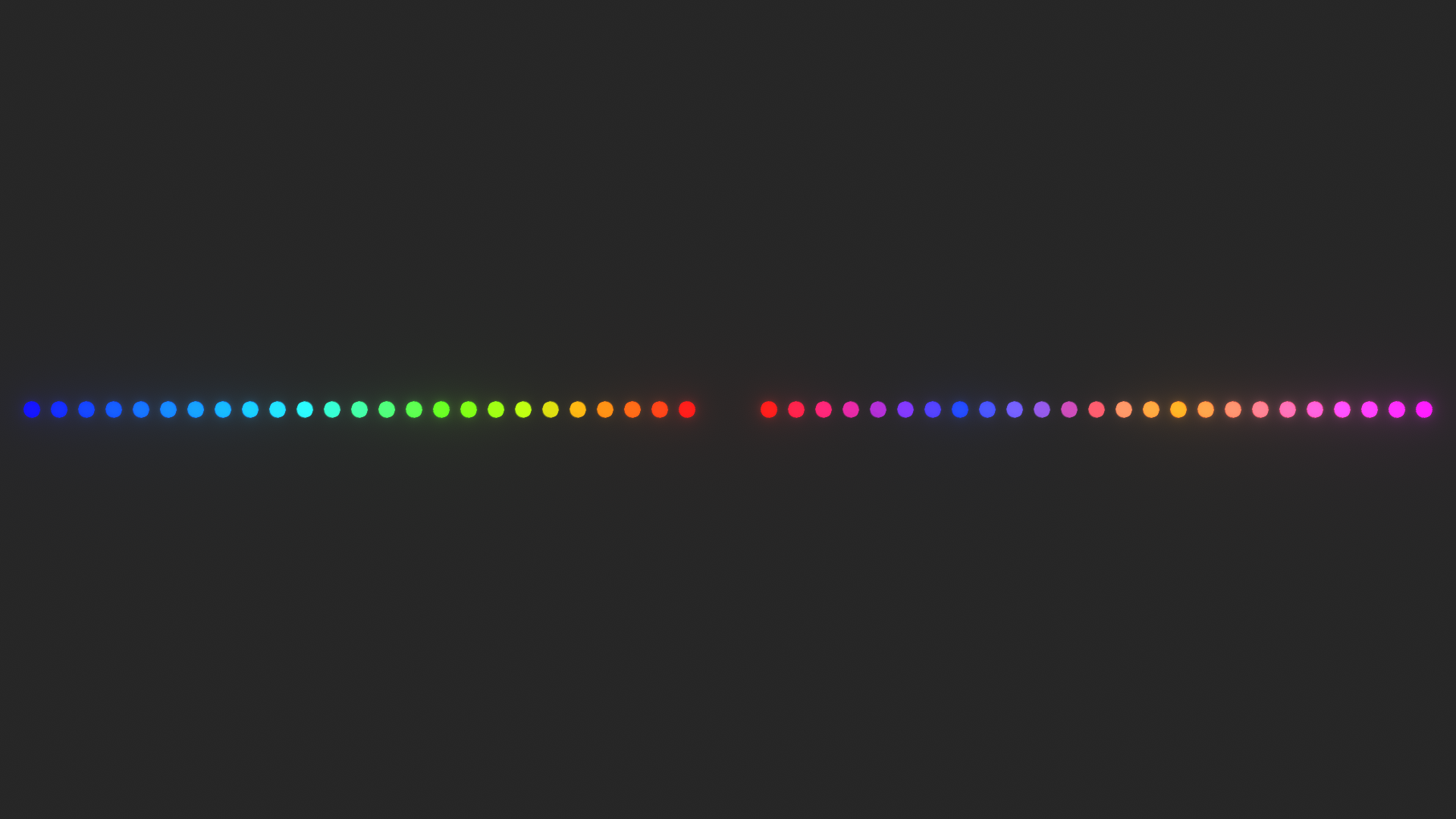
It’s clear we can’t go between pure complements without hitting white. (Well, if we go linearly.) If we want to stay saturated, we can stay on the outer rim of the color wheel:
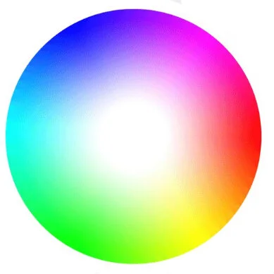
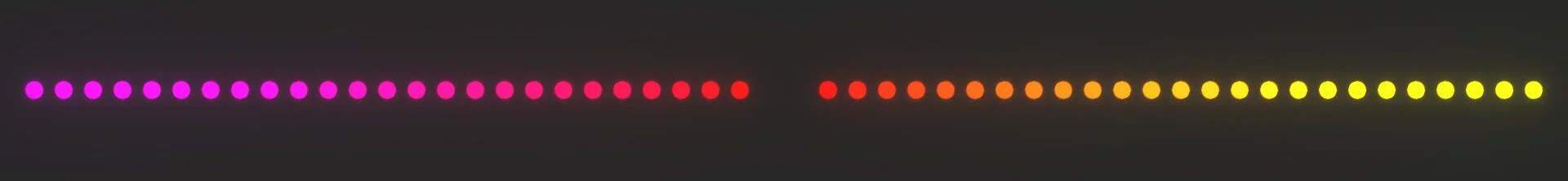
However, that’s rainbow mode. I don’t like to use rainbow mode. It’s too much of a trope. However, hinting at and dodging tropes can be exciting. If we don’t require shows be fully saturated, we can stick to an outer “ring:”
If we stick to the very outer edge, to go from magenta to orange, we have to pass through red. However, we might be able to duck under (by desaturating red) and skip past it like the following:
If this works, then we should see a color sequence of magenta->orange->red. Red won’t seem to be between orange and magenta.
This worked surprisingly well. I don’t get a sensation of red until the end. Just after the magenta, the colors do desaturated noticeably, but they still feel quite saturated. I’ll call this a win. In theory, we can duck and rewind around the color wheel to create saturated sequences without resorting to rainbow mode.
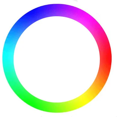
Staying in the Outer Saturation Ring
Now we know we can stay inside some ring at the outer edge of the color wheel. In theory we can even go between near complements if we just add saturating back to the areas that would have become too close to white:
(TODO: the above example is too subtle.)
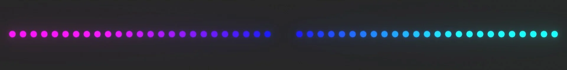
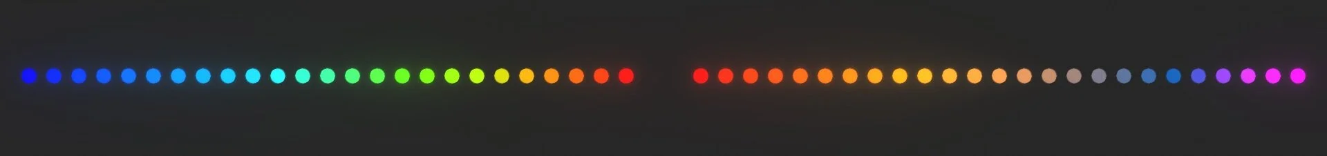
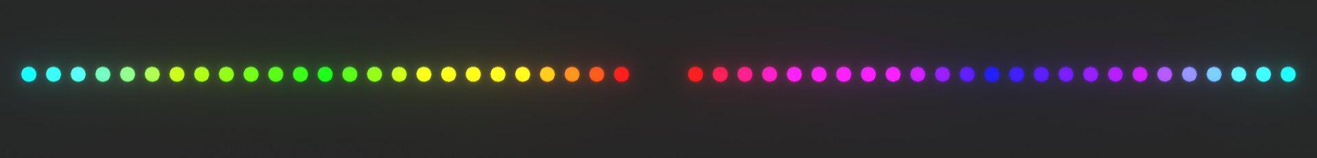
Getting from red to cyan while avoiding rainbow mode
If skipping over red when going from magenta to orange worked, we should be able to duck and rewind around the color wheel in general. Getting from red to cyan in rainbow mode would be reds->magentas->blues->cyans. Trying to duck around this trope while staying saturated we get:
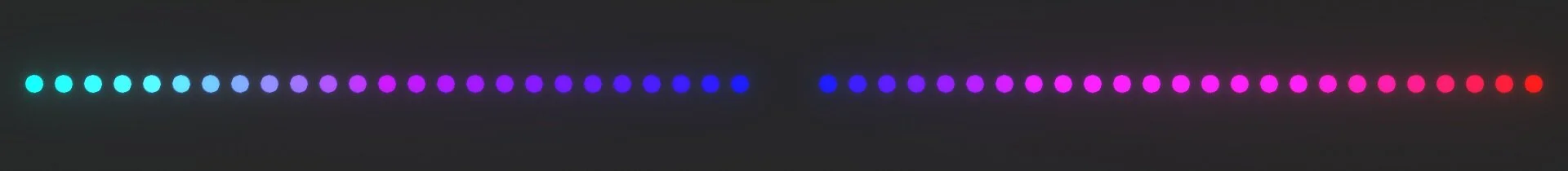
It works OK. Desaturating magenta seems hard. Red was kinder. However, the main goal of creating saturated sequence that doesn’t rely on the standard sequence of the wavelengths. Adding the other direction around the color wheel gets this:
It doesn’t work as well trekking through the greens.
(The even more draftier part of the experiments are here.)